Your website is the central marketing hub of your dental practice, and as such, it must be planned correctly and built to Google Webmaster standards (SEO-Ready). There are many way to structure and build a successful website, and after years of building over 100+ websites for our clients, we know that a custom-built WordPress-based website is the ideal approach.
Unlike most other companies, we are friendly with your other vendors. If you have us build your website and you'd like to work with us for your medical SEO needs, great! However, if you have a different SEO provider you'd like to work with, that's also no problem; we're happy to help and provide whatever information or assistance your other vendors need (with you permission, of course).
All of our dental website packages include a selection of content from our website, contentdentist.com so you can select the content that's most relevant to you and your practice. And while we encourage you to tweak the content to the specifics of how you practice (i.e. what specific take-home whitening product do you offer), Dr. Wank can write the content with you personally for an additional fee.
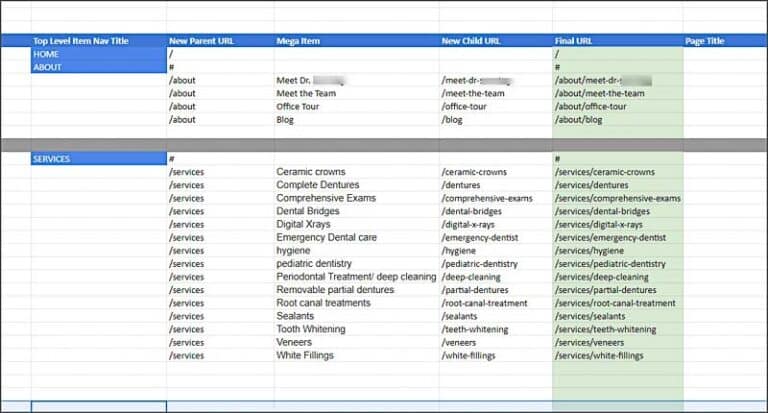
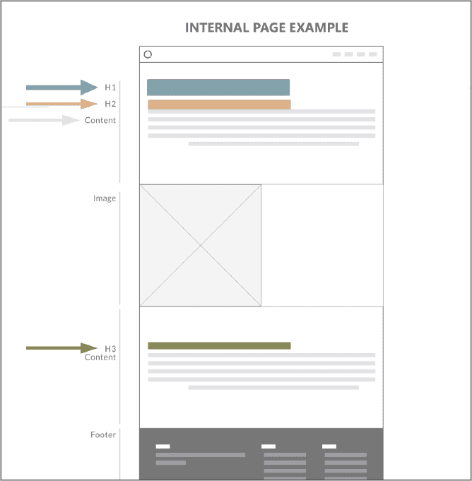
And because we know that website architecture and structure matter to your visitors and to Google for search engine rankings, we make sure that your content is well planned-out and organized:
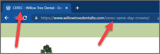
Lots of companies can tell you that your site is "SEO-ready" but what does that really mean? A website that's SEO-ready has the structures in place so that if you wanted to invest in an SEO campaign later on, you won't have to rebuild your entire site. Let's look at a few examples at what features SEO-ready websites have (and all of our websites have, as well):
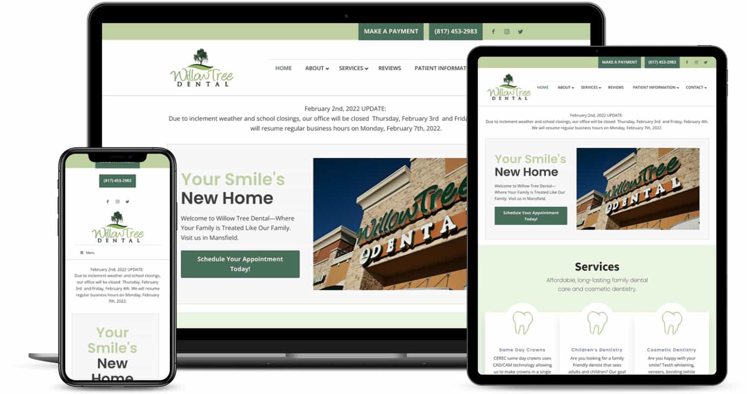
Your website is the central marketing hub of your dental practice, and as such, it must be planned correctly and built to Google Webmaster standards (SEO-Ready). There are many way to structure and build a successful website, and after years of building websites for our clients, we believe that a custom-built WordPress-based website is the ideal approach.
1. The first thing we do is learn from you, the client, what your goals are what you are looking for in a new website. Many clients tell us to "do what you think is best" but that's not the correct approach. Think about it how we as dentists approach a new patient - we know the dentistry and technical aspects of what need to be done, but our treatment plan still must include the patient. So while we will take care of all of the website minutia for you, we work with you as a partner in building your website.
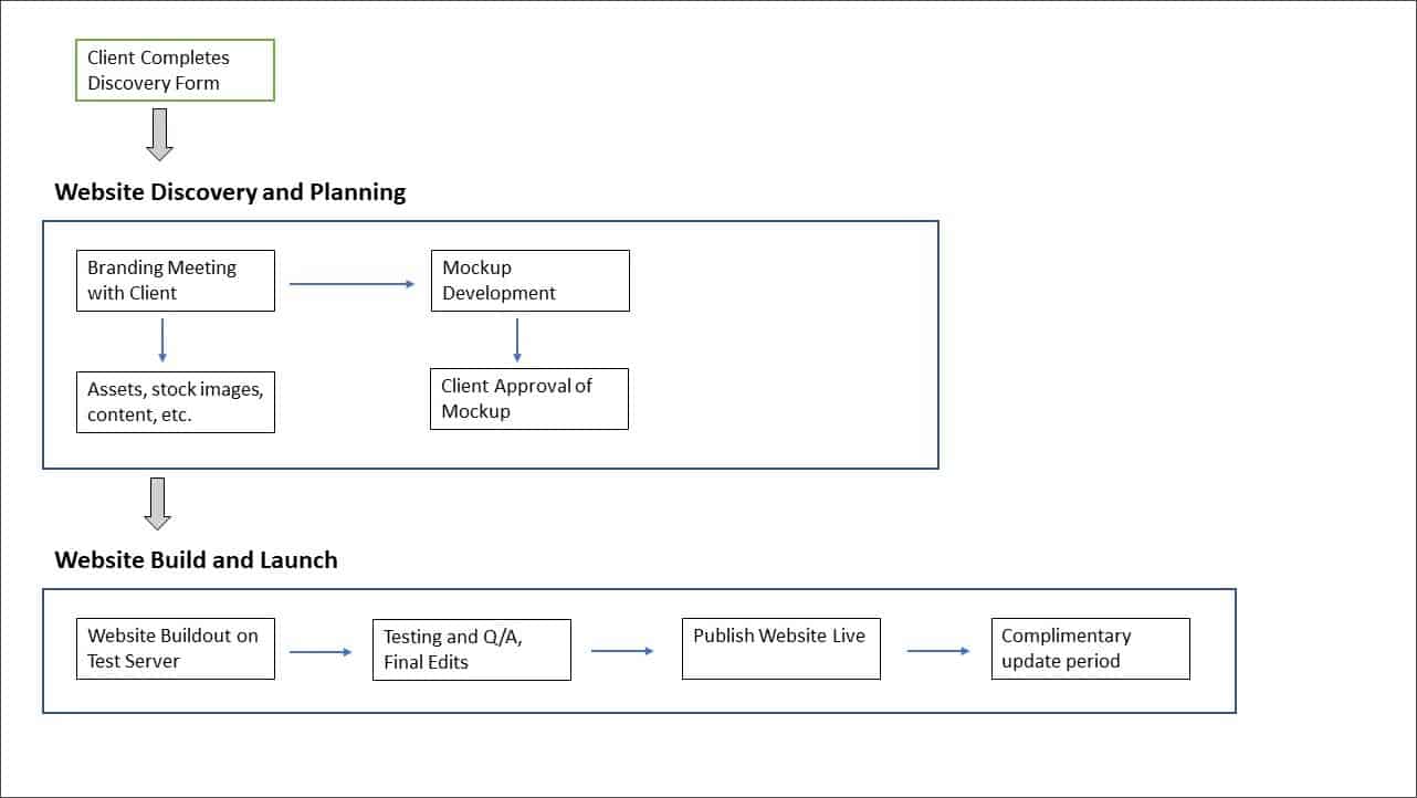
2. Once we have the information from you, we start to plan out your website with you. We have a meeting with you and our team to learn about you and your practice, and we then start building mockups of your website (sample images of what your website could look like. Think of the mockups like temporaries in a large case, or as a wax tryin for a denture.
While the mockups are being designed, we work with you to make sure you have all of the important accounts in place including Google Analytics, Google Search Console, and an iStock photo account so you own the licenses for any stock images we may use.
Before we start to code the website, we get your approval of the mockups (again as we'd do with temporaries or a denture). We want to make sure everything looks as you'd expect before we start coding.
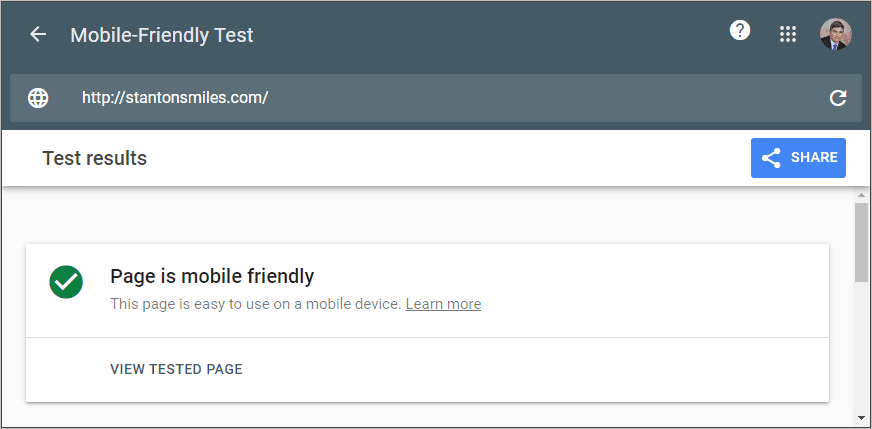
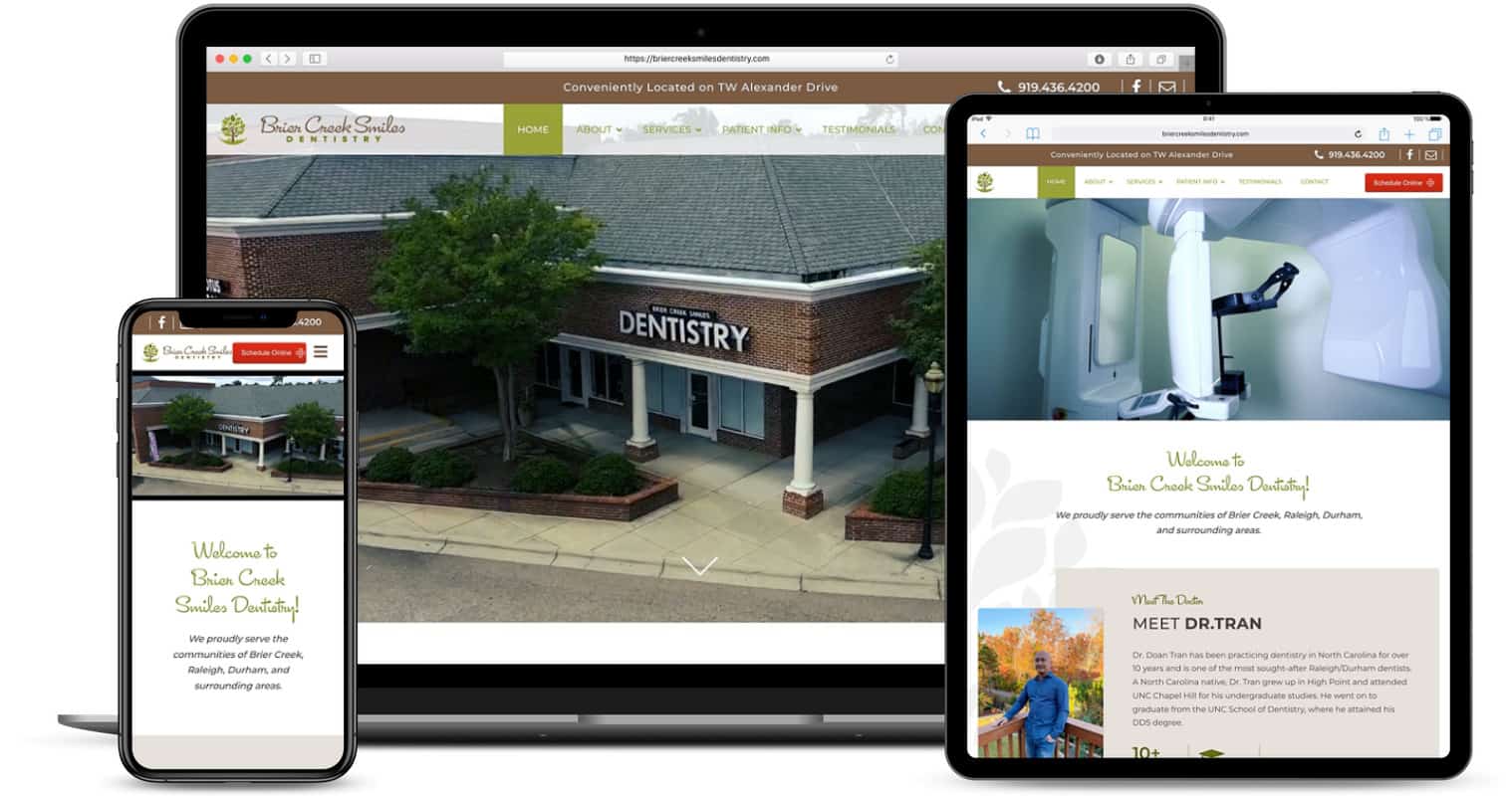
3. We then begin the coding process where we build your website on a private test server. it takes around 2-3 weeks to complete and you will be able to view the site as it's being built at any time. Once we've completed the build, we do rigorous testing and go through our quality assurance process which includes testing the website's look and feel on smartphones and tablets, as well as the website's speed and loading time. With your final approval, we then publish the website live on the Internet, and you have a complimentary update period -- just in case you find a mistake or need something tweaked.
1. Should I have a separate page for each service on my website? Absolutely, 100%. When people search for a topic in a Google search, Google does its best to show the pages that are most relevant to the search. Thus, if someone is searching for "dental implants", a page that's dedicated to dental implants will be more relevant (and rank better) than a page that lists dental implants as one of many different services. You have to think from the perspective of the user -- which of the above two pages will give the user the most valuable information about implants?
2. What should be in the footer of my website? The footer is the very bottom portion of your website and it should be the same on every page. Make sure your footer contains your practice's name, address and phone number, along with your office hours. You should also consider having a Google Map in the footer so people can click the map to get directions. Don't forget to add a privacy policy and a terms of service link to the bottom of the footer, as well.
3. How many forms should I have on my website? In general we recommend two forms. A short contact form that makes it easy for people to get in touch with you and ask a simple question (such as, " Do you accept Delta?"). The idea is that you don't want to force a someone who has a quick question to have to fill out an entire appointment form. The visitor might not want to make an appointment, and while we know on our end that filling out an appointment form is not a commitment, people don't always know that. Thus we want to lower the barrier as much as possible to make it as easy as possible for someone to get in touch. And while we're on the subject, use the fewest form fields as possible in your forms, as studies show that shorter forms have higher response rates.
The other form we recommend that our clients have is an appointment request form. This form allows someone to request an appointment - but does not let the person select the specific date, time, or length of the appointment. With this approach people can submit the form and then your staff can contact them in order to schedule the specific date and time, so your FD can ultimately control how much time you have for the procedure in question.