When developing a new website for your dental practice or redesigning an existing one, there are important key concepts you need to be aware of before you build.
1. The Internet Marketing Workflow. Before you start doing anything with your website, you need to understand where your dental website fits in the big picture of your overall Internet marketing workflow. Dr. Wank has termed this cycle, 'The Internet Marketing Workflow" and there are 4 phases of the workflow: initial website development, driving traffic, analytics and goal tracking, and routine maintenance.
For example, you must have a website that's indexed in search engines and that's esthetically pleasing to your visitors before you start paying money to drive traffic to the site.
2. Content Management Systems and WordPress. In the old days you always needed a website developer if you wanted to make any changes or updates to your website. Today, things have changed for the better, and we urge everyone to use a content management system because content management systems such as WordPress allow you to edit a website as easily as you would edit an email. Of course there are limitations, but 95% of the changes that most professionals would need to make to a website are easily doable in WordPress without the need for a developer or advanced technical training. When we build websites for clients, we include one hour of WordPress training so our clients know how to make content edits, to add/remove images, and to add/remove pages and blog posts.
You could use other content management systems (Wix, GoDaddy) but WordPress is hands-down the way to go for any professional or small business that needs a website. Each of the above systems has limitations - the two most critical of which are that you are limited in your editing and design options, and you cannot easily move a website from one of these platforms to WordPress. Thus, you should always try to avoid proprietary content management systems/website platforms. With WordPress, if you want to change you design, developers or management team, it's easy to go from one provider to another without having to rebuild your website.
3. Website, Asset and Account Ownership. There are quite a few reasons why YOU must own your own dental website and all of the assets, not the least of which is that if you ever want to move your website from one provider to another, you can't do it if you don't own the site. Similarly, make sure that you are an administrator/owner on all of your Google Accounts including your Google Analytics account, your Google Search Console account, and your Google Ads account (if you are running ads). We've dealt with situations in the past where a client wants to work with us, and the client's previous agency won't share Google Analytics data. This approach from the client's previous agency is preposterous, in our opinion, because the client should own the Google Analytics data and determine who can see it -- and not the agency.
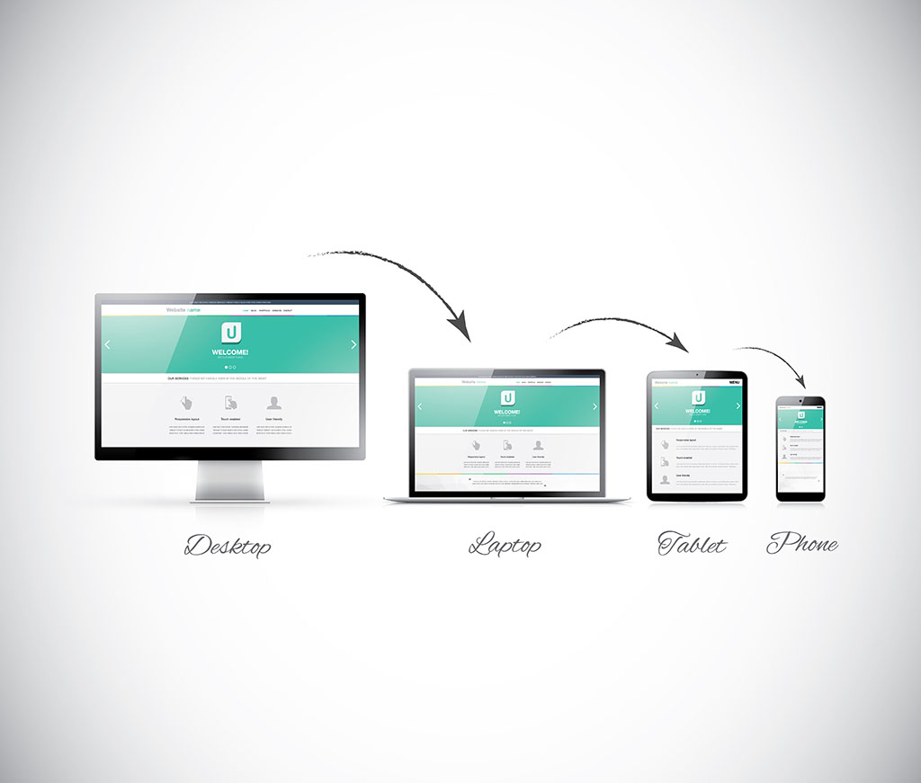
4. Follow responsive design standards and make sure your site is SSL secured. All websites need to be build with a responsive design site architecture. In practical terms this means that your website should look the same on all devices (desktop, tablet, smartphone), and the website elements (text, images, etc.) will scale down to the size of the device. And remember, you do NOT need a separate site for the different devices (that was from decades ago).
While you're at it use a .com domain if at all possible. .net and many others exist, but nothing exudes confidence and speaks of professionalism such as a .com domain.
5. Make sure that your website's navigation is logical, makes sense, and follows web standards. This means that you should stick to top-level items such as Home, About, Services, Insurance, Financial, Reviews, and Contact.
And remember that the order matters! You want Home all the way at the left, and contact all the way at the right. The idea is to make it as easy as possible for people to navigate your site so they don't have to think to find the information they need.
6. What pages must your website have in order to be competitive and successful? For starters make sure that you have a dedicated page for each service you'd like to possibly rank for in search engine results. If you want to rank for Invisalign, the first thing you need to do is have an Invisalign page. Too many practices load up all of their services into one single page, but as any dental web designer should tell you, your dentures page should be about dentures and your extractions page should be about extractions.
Of course you can make your site even better with internal linking so that your extractions page links to your bone grafts page and/or your implant dentures page. Remember, give people the information they want and then lead them down to the next most important piece of information ("...after the extraction you'll probably need a bone graft.")
7. Make your website easy to use, and don't make your users think. Here's a quick true story about how important it is to make your website consistent with current website standards.
8. Your colors make a difference as do your image selections. For example, people expect links to be blue and underlined, and while you can have links that are just underlined, or have them be blue without an underline, don't make them green or orange or use dashed lines to represent links.
Also consider accessibility in terms of contrast. If you have light green links on a green background, it might look nice from far away, but it's going to be very difficult to use from a practical perspective. Google looks as usability, and text/background contrast is one of the big factors they examine.
9. Don't forget the social icons. While managing social sites and posting on social sites is a chore and can be frustrating and time-consuming, having social icons on your website reassure your potential new patients (and your existing patients) that you are "up-to-date." You need to make sure your website is error-free and builds trust with your visitors. That means that if your website has broken links which means you click and you see a "not found" page (we call them "404s"), you must fix these pages. If the broken link is a mistake, then simply fix the link. But if the link goes to a page that no longer exists, either remove the link for the referring page, or redirect the broken page to one that works. And always make sure that your 404 page says something friendly and gives people a chance to navigate back to somewhere else on the site so they don't pick up and leave.
10. Think about website accessibility - not everybody has as fast an internet connection as you do, and not everyone uses a large laptop or smarphone with a ton of screen space.
11. Make sure people can easily use your website. For example, all of your forms (contact form, appointment form) should have instructions. One of the best set of instructions we use for our client sites is telling visitors NOT to use the contact form to cancel appointments or for emergencies -- people will still use the form for these purposes but a simple line of instructions can cut down on headaches for you and your team.
12. You need an email address that matches your domain meaning that your emails should look like [email protected] (e.g. [email protected]). It's fine if you have an office email such as "[email protected]" but try to keep at least one email with your domain name (e.g. [email protected]). Email is very inexpensive these days and we recommend that our clients get their email via Google Workspace or Office 365. Both services are reliable, and having email live with one of these services is convenient as well since if you decide to move your website to a different host or if you redesign your site with a different company, your email won't be affected.
13. Don't forget to have a working backup. If you use WordPress (which you should), there are a number of ways for you to easily have access to your own backups. For our clients we use a backup plugin called Updraft which allows us to easily and automatically send our clients backup copies of their website to their storage option of choice (e.g. Dropbox, Google Drive).
14. If you just purchased a practice, there are important factors you should consider as they relate to the existing website and a possible new website. The most important ones include making sure you get access to the website domain and the Google My Business account so you can easily update any necessary information.
15. And if you are starting a new practice and you don't have a website yet, you might want to post a temporary or holding website while your new site is being built.

